The Problem –
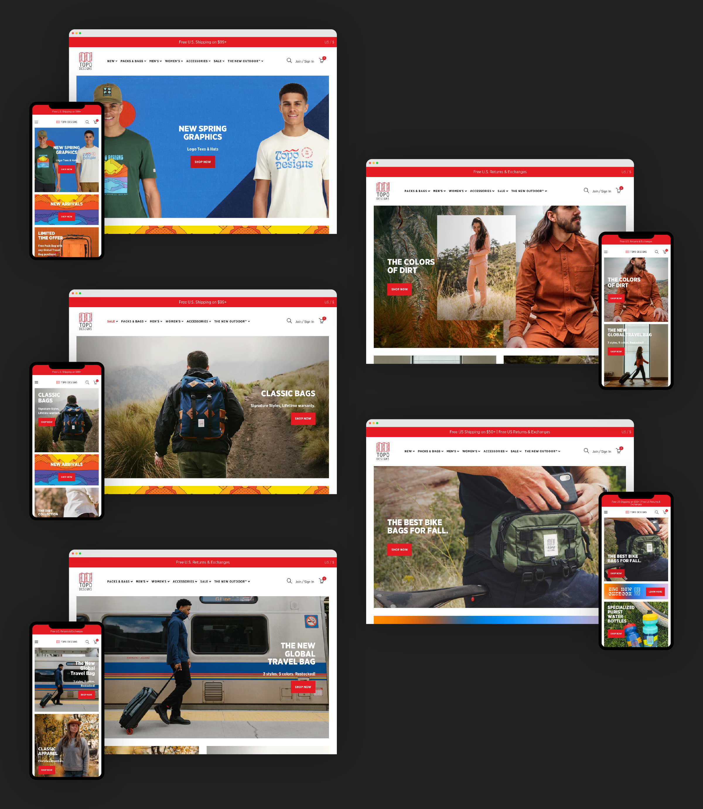
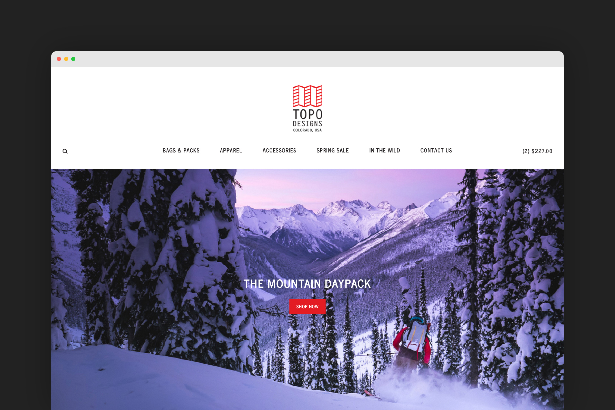
Topo Designs' original homepage solution only allowed for the position of text and buttons in absolute vertical and horizontal center of imagery. An update was needed to allow for more flexibility with position options of text and buttons across desktop and mobile when changing campaign imagery and messaging through the Shopify theme editor.
The Concept –
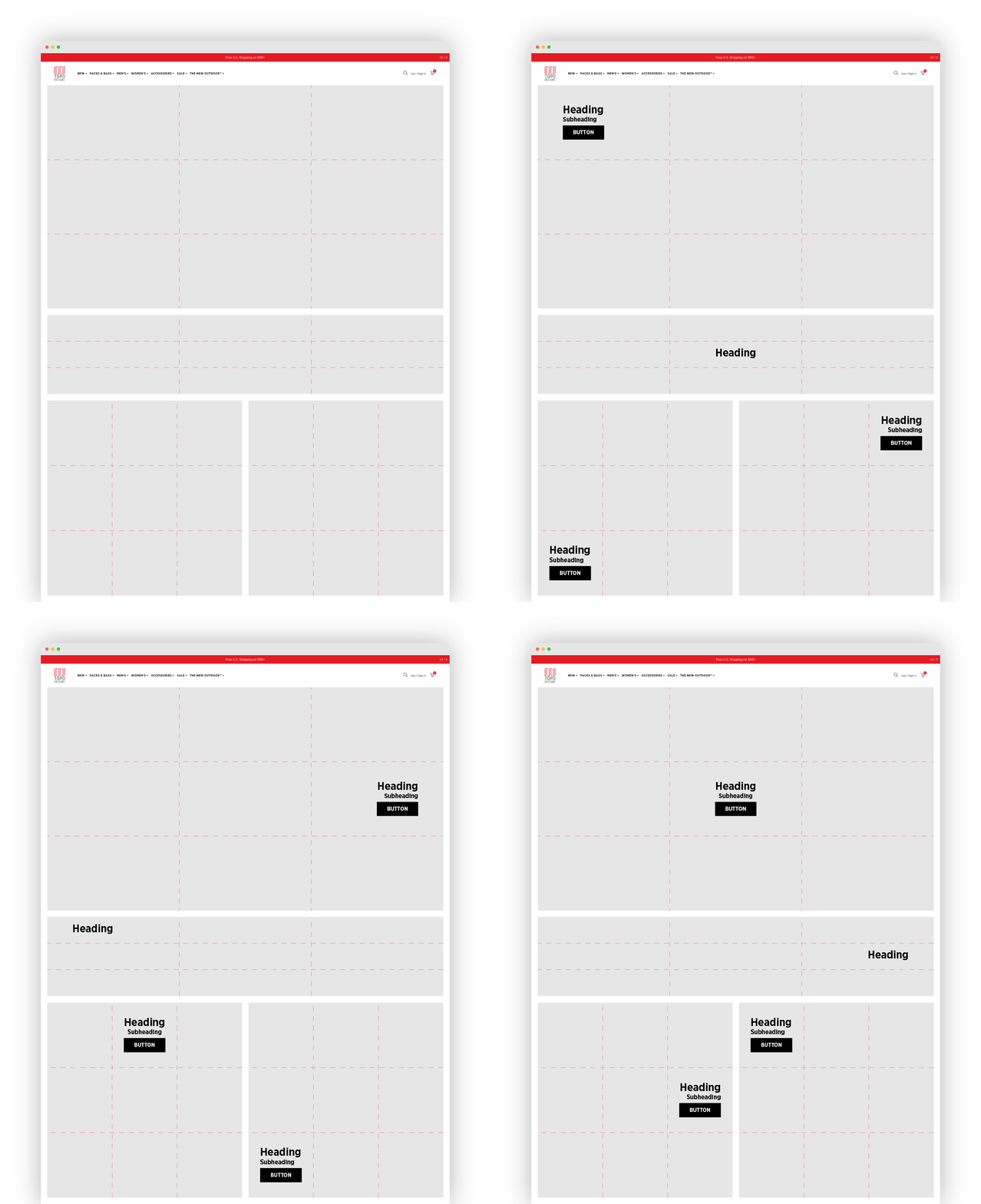
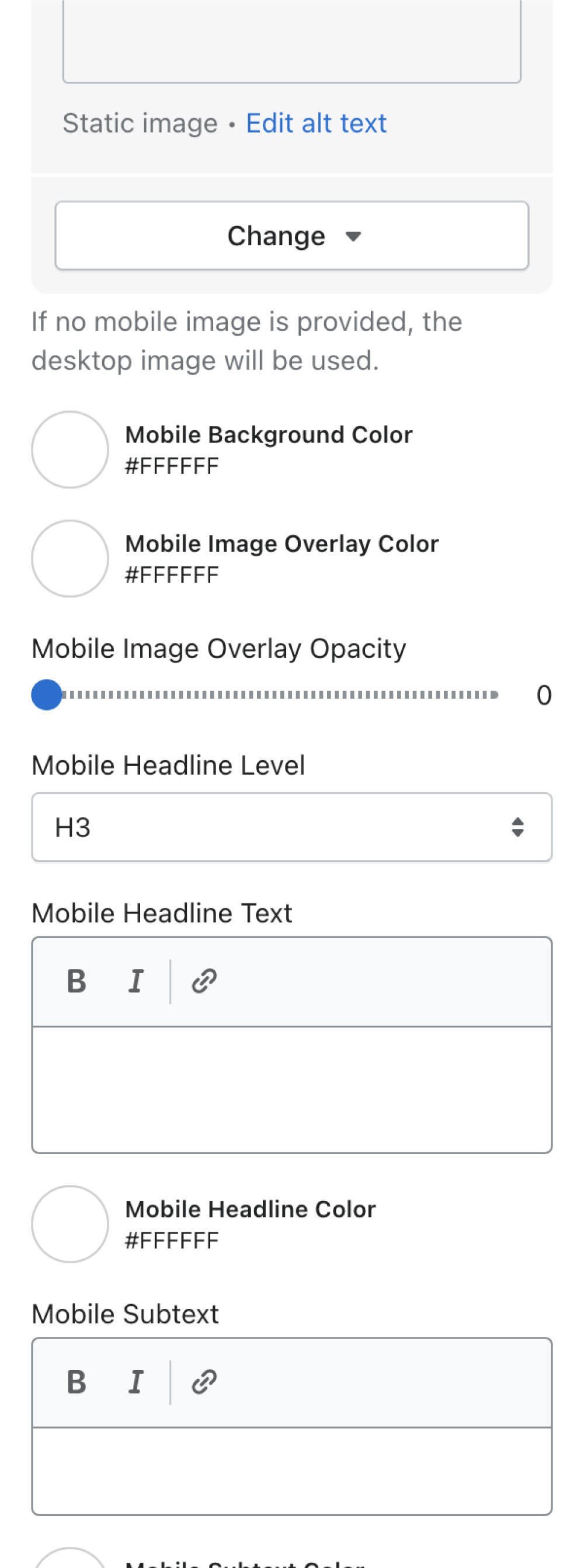
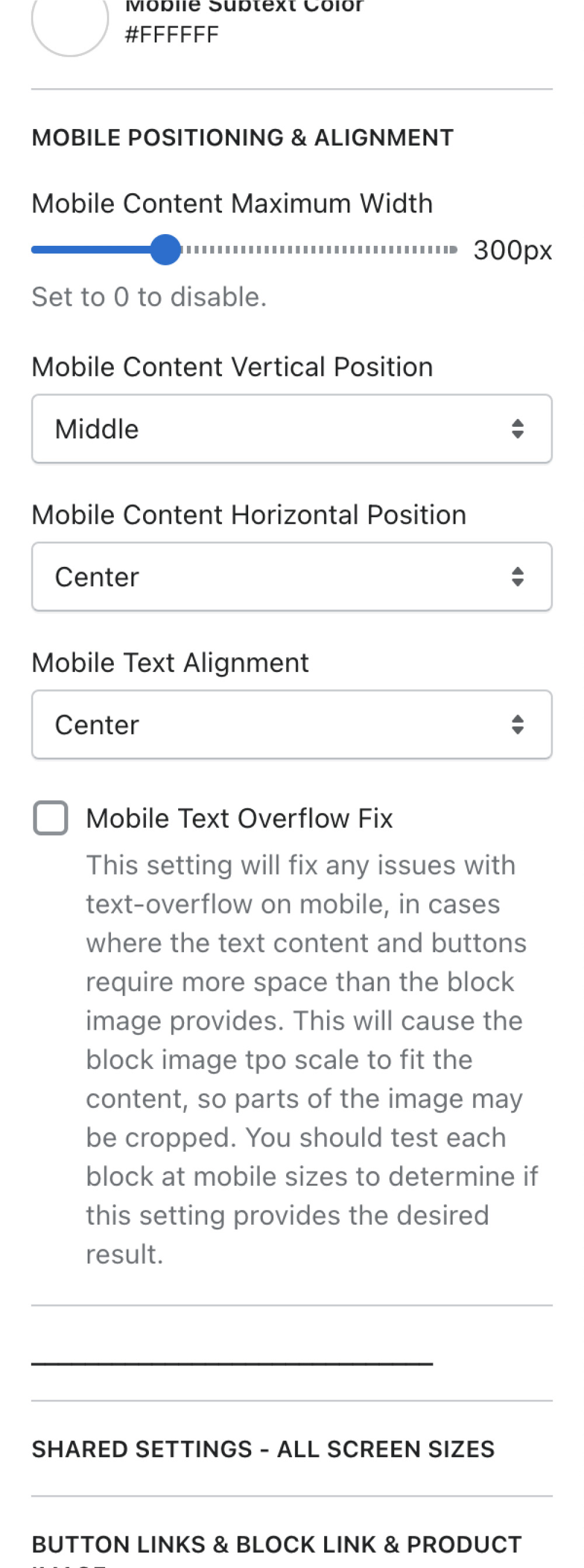
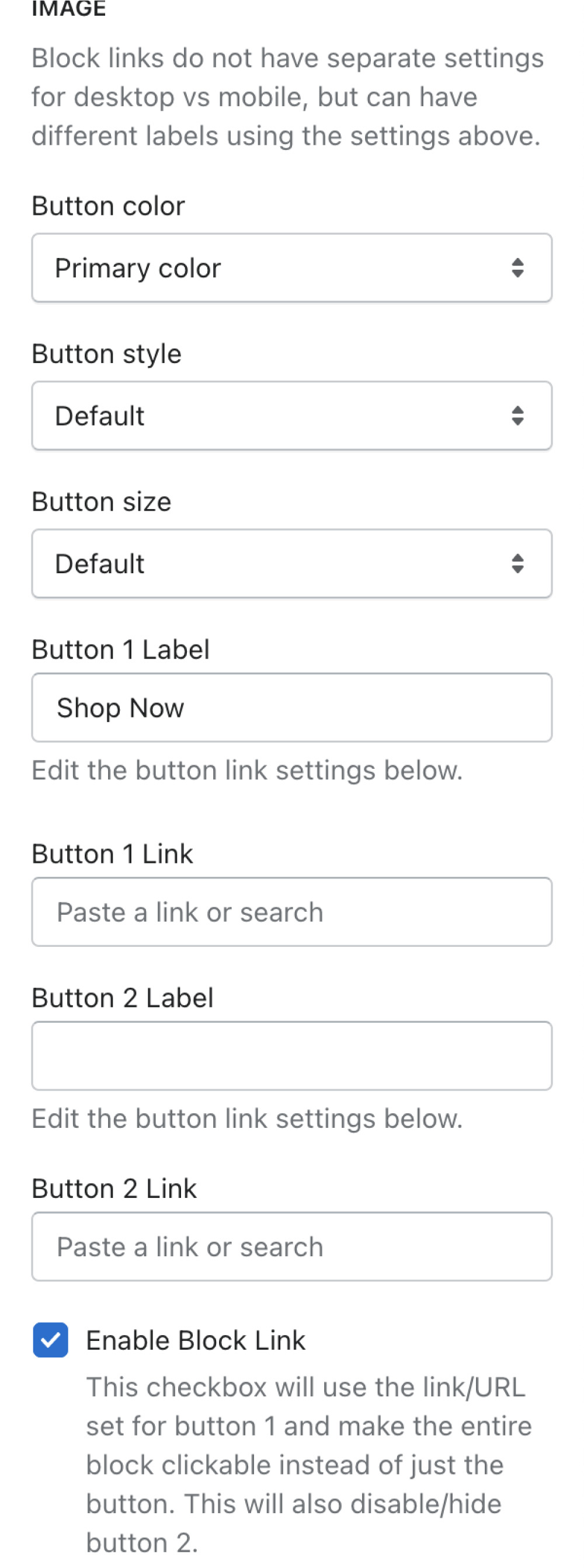
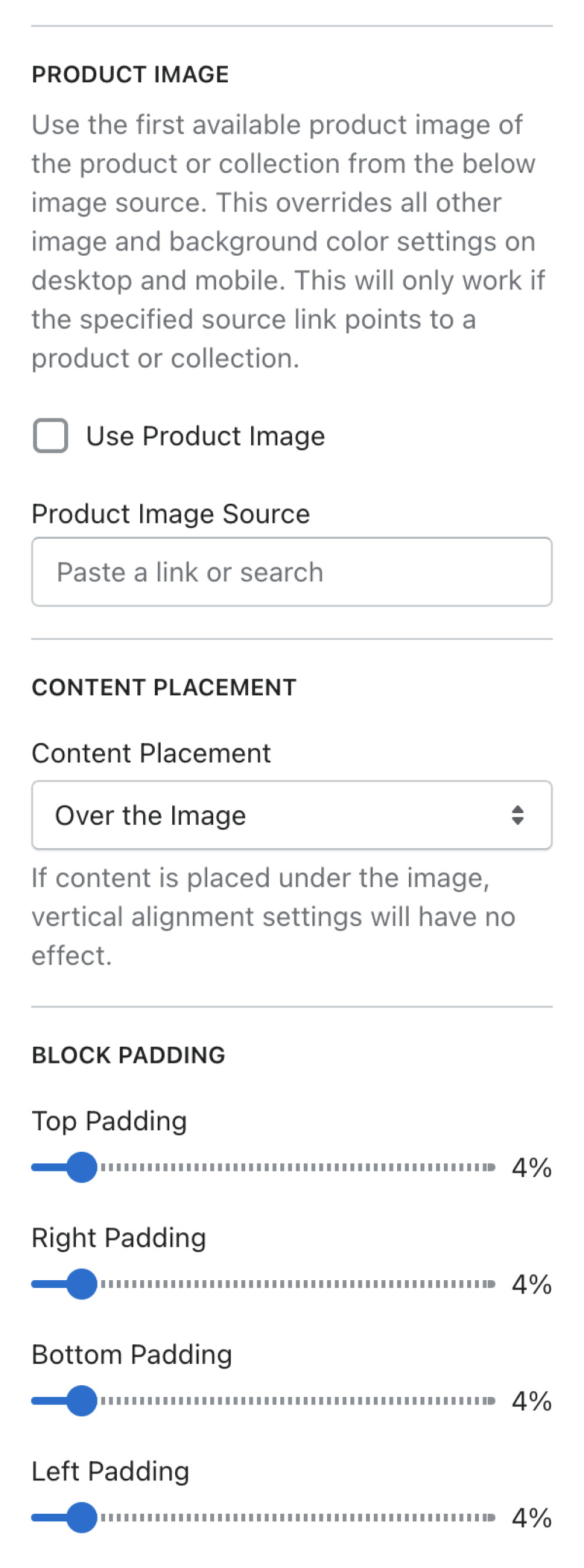
The goal was to implement a flexible Shopify section that would allow for a variety of positioning and alignment options for messaging and buttons around the lifestyle imagery that Topo Designs uses across their homepage. This solution would also need to support flexible image sizes, alternate messaging, heading and subheading styling, font colors, primary and secondary buttons, links, and adjustable padding for both desktop and mobile.
Shopify Section Configuration
The Solution –
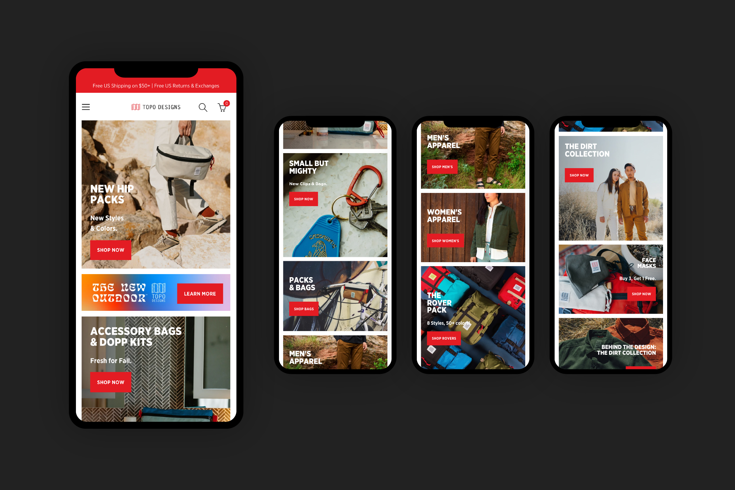
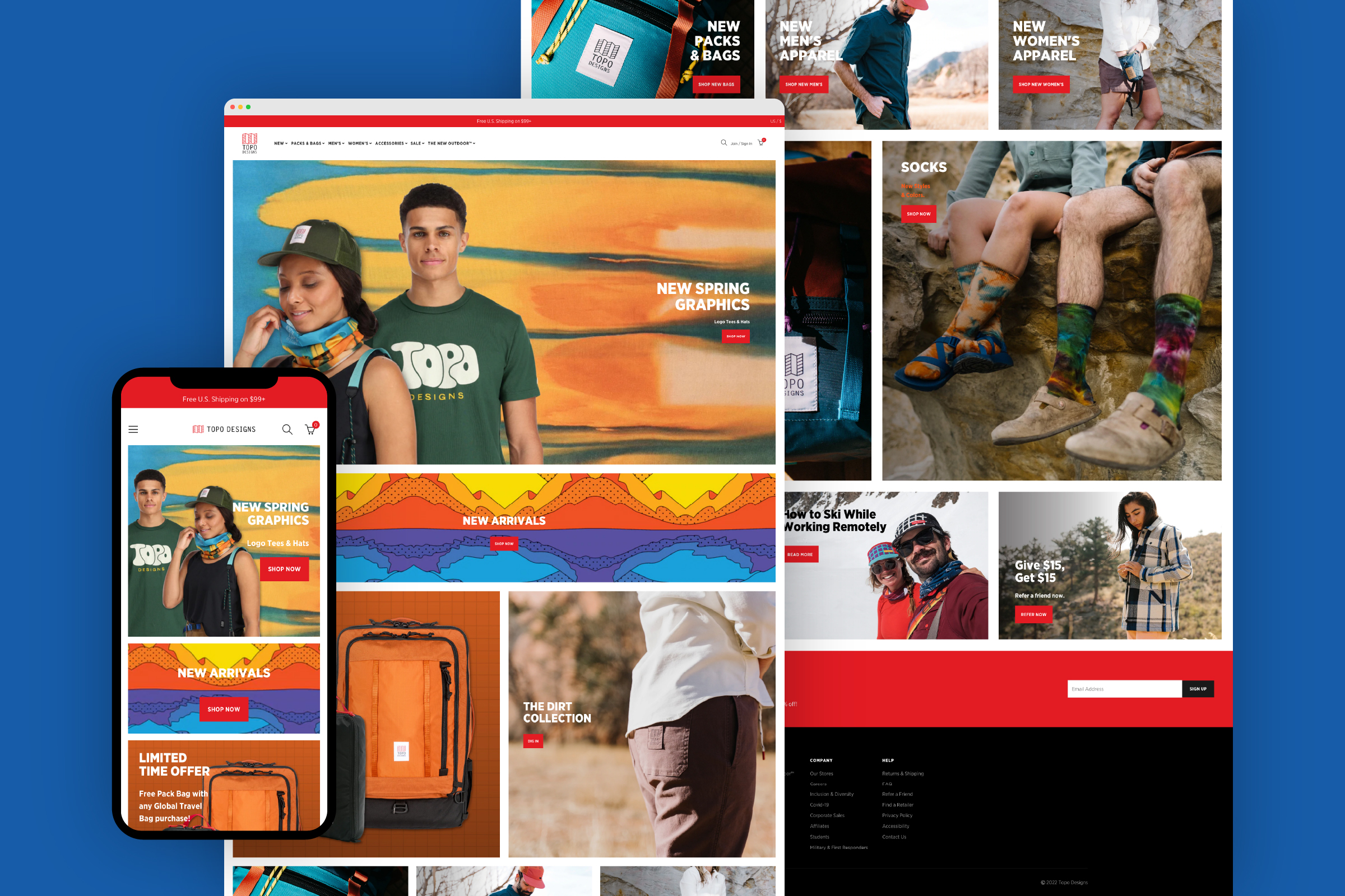
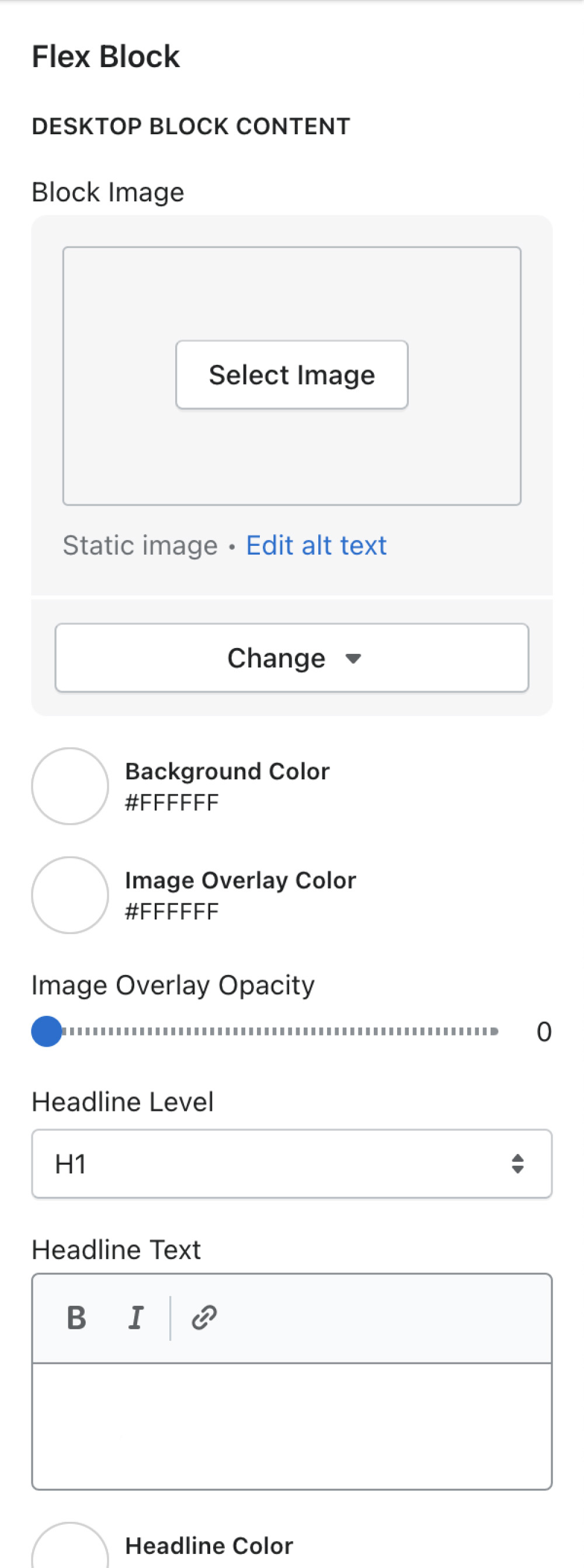
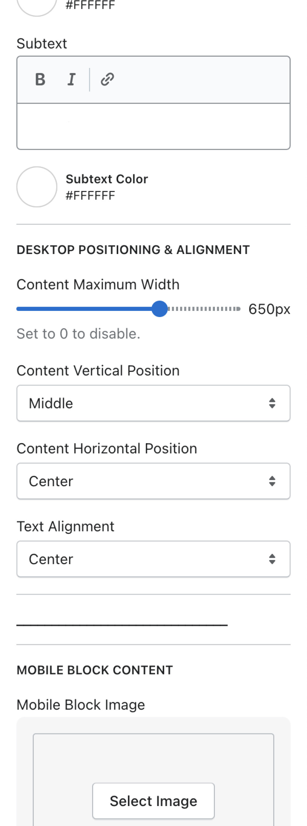
The new layout design system allows for any team member to modify content in a quick manner. This created the ability to implement a variety of layouts and the versatility to position text and buttons around the products featured in an image. By utilizing two positioning dropdowns, multiple options are given for alignment. Options include both top, middle, bottom, and left, center, right. There is an additional dropdown feature that adds text alignment options like left-align, center-align, and right-align. This gives the user the ability to position and align text in nine different quadrants and also tweak padding via a slider to fine tune the layout. These elements together resulted in greater flexibility and efficiency for the homepage of the site.
